Widgets
Teamscale offers a large variety of highly configurable widgets to create personalized dashboards. These widgets and their configuration options are displayed in the following. Some options are the same for all widgets. Thus, they are described only once at the beginning.
Common Widget Configuration Options
The following table denotes configuration options that are commonly shared by many widgets. As an example, this image shows the beginning of a configuration dialog containing some of these options:
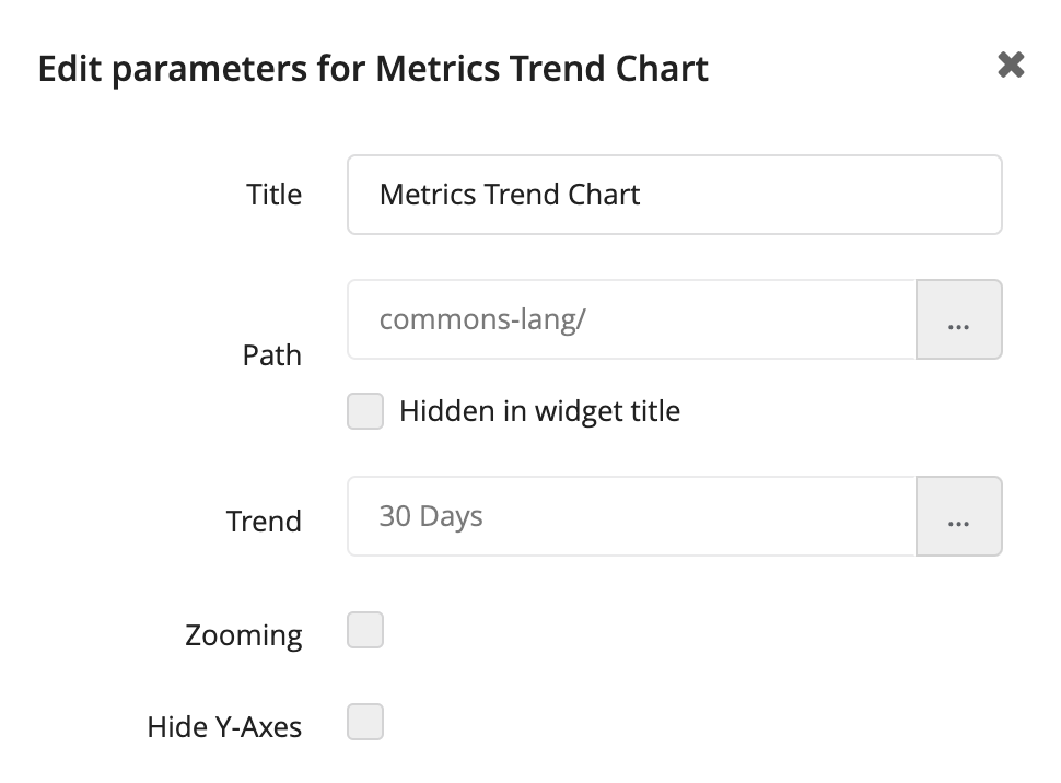
| Title | Each widget can be given its own custom title. Teamscale suggests a default title. |
| Path | The path can be used to select the scope for which the content of the widget should be displayed. The scope can either be an entire project or you can select any folder or component (if an architecture file has been modeled). |
| Trend | Many widgets can display a trend indicating the evolution of a metric. You can configure the time interval, e.g., if the trend should be considered for the last five days. |
| Zooming | Allows you to zoom into the chart. |
| Hide Y-Axes | Removes labeling of the y-axes. |
| Baselines | Shows the baselines of the underlying project as vertical blue lines in the chart. |
| Action menu | Adds a drop down menu with option to view a selected zoom range in the Delta perspective and to download the trend as csv. |
Assessment Pie Chart Widget
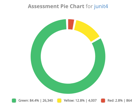
| Purpose | Shows an assessment metric as a pie chart. |
| Metrics | Lets you choose from the available assessment metrics. The thresholds of those metrics are configured in the analysis profile, not in this widget. |
| Legend | Displays a legend for the widget. |
| Show absolute values | If checked, absolute values are shown. For structure metrics, these absolute values are LOC or SLOC depending on the analysis profile. For the comment completeness, these values are the number of (un)documented code entities. If unchecked, only relative percentage values of the assessment metric are shown. |
| Assessment thresholds | Shows target threshold lines. Should be of format »0.05,0.25«, for example. |
Assessment Trend Chart Widget
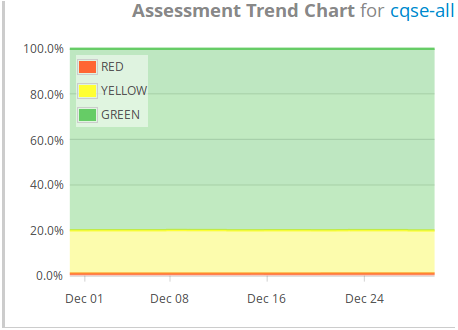
| Purpose | Shows the evolution of an assessment metric over time. |
| Assessment | Lets you choose from the available assessment metrics as configured in your analysis profile. |
| Show ratios | Whether to show ratios instead of absolute values. |
Code City Widget
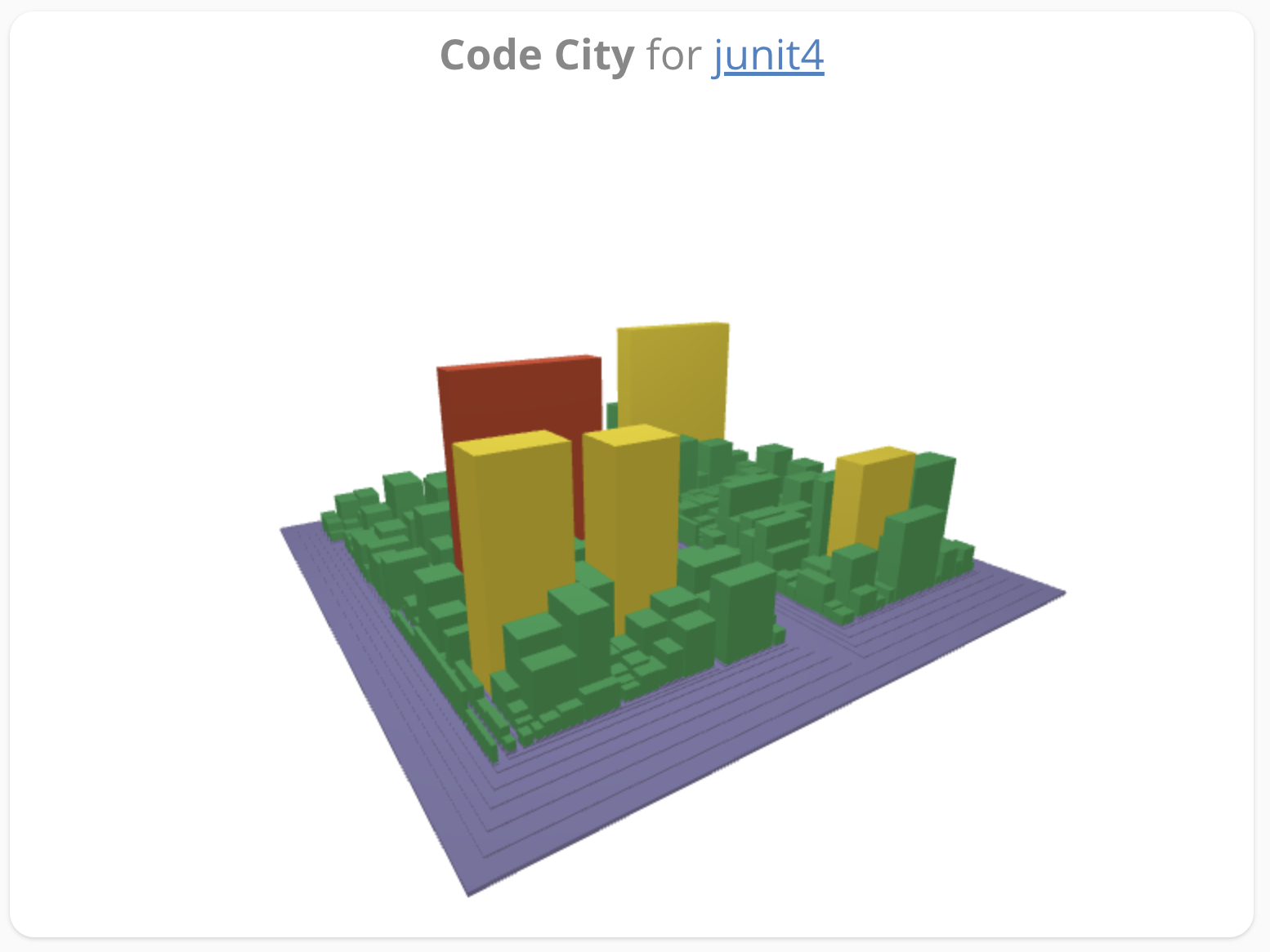
| Purpose | Shows the system as a code city. |
| Area Metric | Metric used to determine width and depth of a code city skyscraper. |
| Height Metric | Metric used to determine the height of a code city skyscraper. |
| Color Metric | Metric used to determine the color of a code city skyscraper. |
| Color | Color used to color the skyscrapers. When using an assessment metric as color metric, the assessment colors red, yellow and green are always used. When using a numeric metric as color metric, a darker color means a larger metric value. |
| Included files | Only files matching this regular expression are displayed in the code city. The regular expression is provided as a Java Regex. To include only Java files, enter .*\.java. You can add multiple include patterns, too, by clicking on . This will provide you additional input fields. |
| Excluded files | Files matching this regular expression will be excluded from the code city. |
Commit Chart Widget
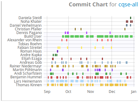
| Purpose | Shows the commit frequency of the development team over time. |
| Min. commits per developer | Number of commits a developer must have made at least in order to appear in the chart. |
| Order | Indicates ordering in which the authors are sorted. You can either select by time, by number of commits or alphabetically by the account name of the authors. |
External Content Widget
| Purpose | Provides a link to external content and embeds it as an iframe. |
| URL | Url for the external content. |
| Allow scrollbars | Allows scrolling within the widget. |
WARNING
When the external content needs to work with cookies, e.g. for login state, the external site must be using HTTPS and have its cookies use the Secure;SameSite=None attributes to make modern browsers send the cookies.
Findings Churn Widget
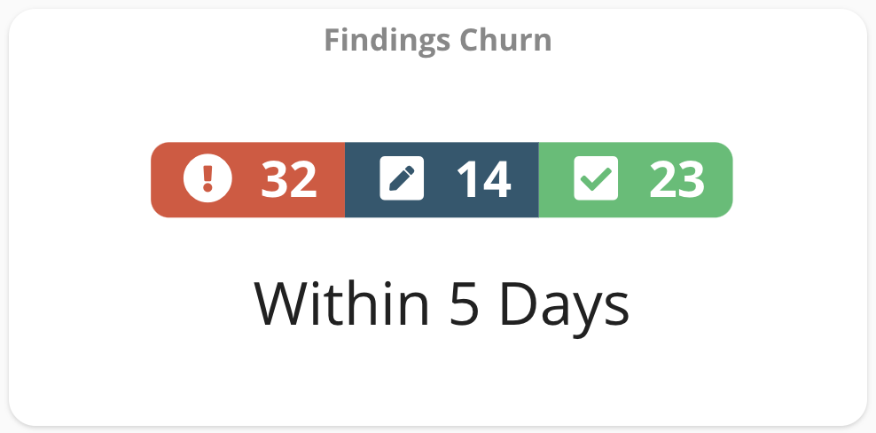
| Purpose | Shows the findings churn within the configurable time interval. Red indicates added findings, blue indicates findings in modified code (based on quality goal improving), and green indicates removed findings. |
| Findings Type | Allows to choose between code findings and spec item findings. |
| Show trend text | Indicates if a label with the trend should be displayed within the widget |
| Filters | Allows to select the findings to be shown in this widget based on, for example, finding group and finding category |
| Type filter | Allows to select the findings to be shown based on flagging. You can exclude or include tolerated, false positive and non-flagged findings. |
Findings Summary Bar Chart Widget
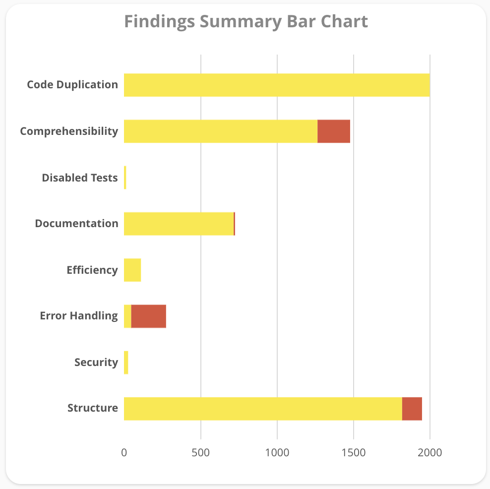
| Purpose | Provides a bar chart as summary of all finding categories. Yellow and red indicates the severity of the findings as configured in the analysis profile. |
| Findings since | Selects a baseline for the findings. Only findings introduced after the baseline are shown. |
| Severity filter | Choose if all, only red or only yellow findings should be displayed. |
| Show timespan text | Choose whether the timespan since the baseline should be displayed. |
| Selected categories | Select which finding categories should be considered in this widget. The available categories depend on the underlying analysis profile. |
| Type filter | Allows to select the findings to be shown based on flagging. You can exclude or include tolerated, false positive and non-flagged findings. |
| Detail level | Choose for which level a bar should be created; you can pick »only categories«, »categories and groups«, »categories, groups, and rules« or »groups and rules«. |
| Horizontal orientation | Indicates whether bar chart should be oriented horizontally or vertically. |
| Sort by findings count | Indicates whether chart should be sorted by number of findings or by category names. |
| Show findings count | Indicates whether the absolute number of findings should be displayed in the chart. |
Findings Summary Table Widget
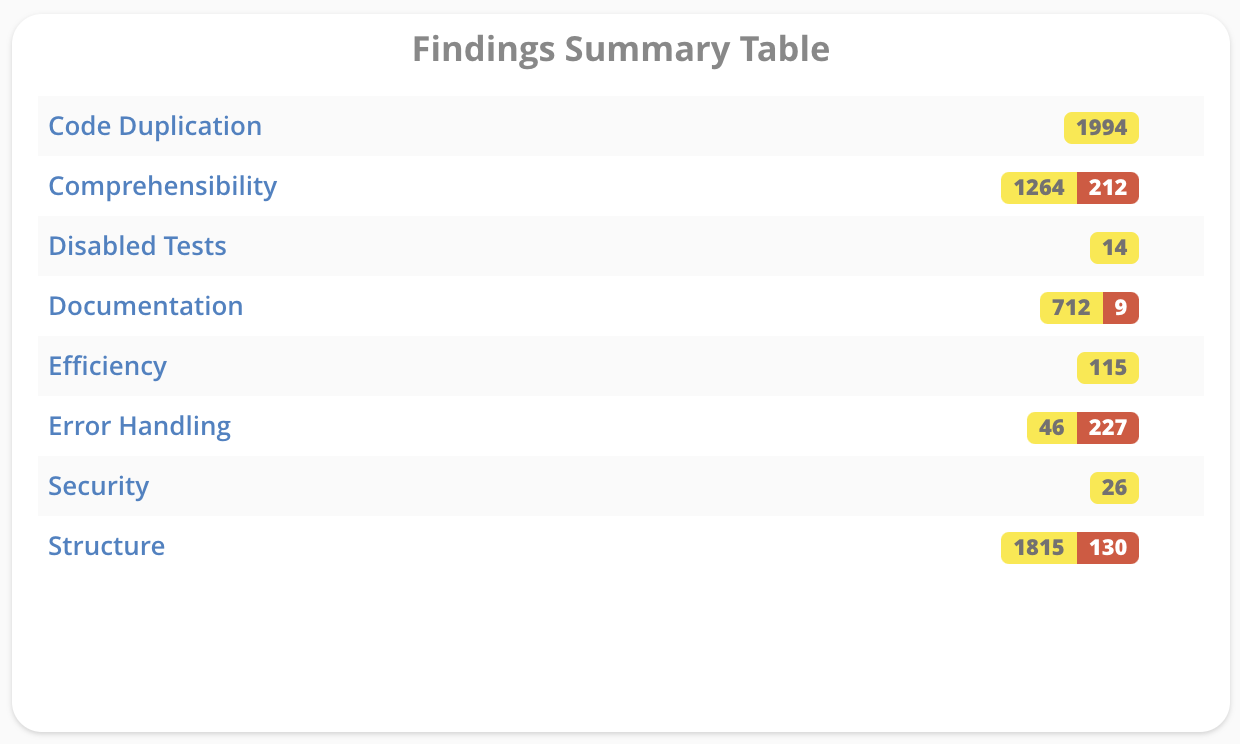
| Purpose | Provides a table with a summary of all finding categories. Yellow and red indicates the severity of the findings as configured in the analysis profile. |
| ... | Please refer to the Findings Summary Bar Chart Widget |
Issue Table Widget
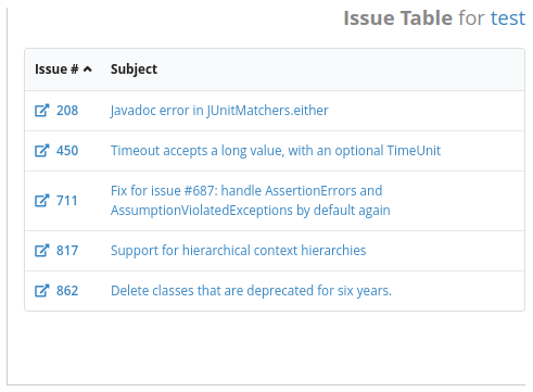
| Purpose | Shows all issues matching a given query. |
| Enter Query | Choose whether to enter query or select a stored issue query. |
| Stored Issue Query | Select previously saved issue query to find matching issues. Selected query will be shown in the field **Query** . |
| Query | Enter query to find matching issues. |
Label Widget

| Purpose | Adds a label to the dashboard. |
| Text size | Choose between small, medium and large. |
| Text color | Pick the label color. |
| Enable formatting | Format the text using markdown formatting. |
| Align center | Center the text horizontally. |
| Wrap text | Uses more than one line if necessary. |
Metric Bar Chart Widget
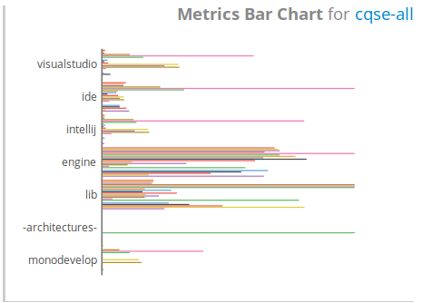
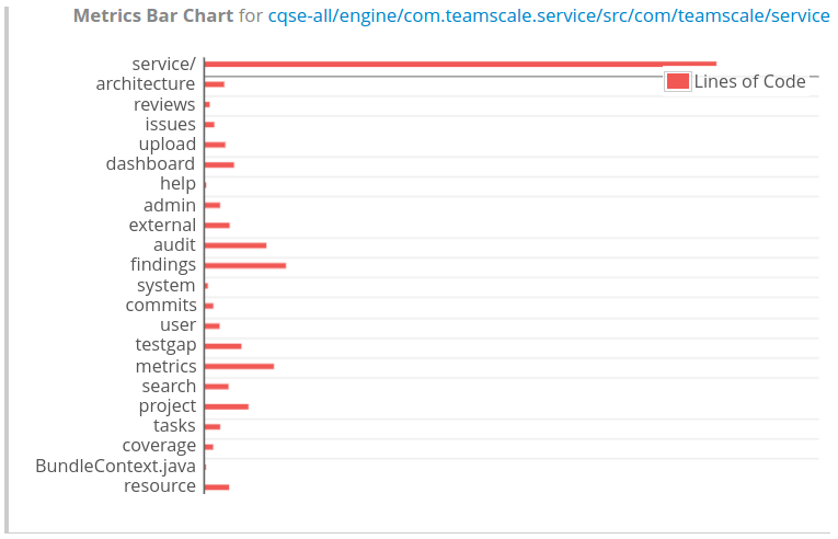
| Purpose | Displays metrics for folders or components as bar chart. Can be used, for example, to compare subfolders by size (LOC). |
| Metrics | Select the metrics you want to display as bars. Available are only numeric metrics. As default, all are selected. |
| Metric Threshold Configuration | Select your threshold configuration profile. |
| Hide Threshold Configuration Markers | If unchecked, thresholds from the selected threshold configuration will be shown as markers in the bar charts. |
| Additional Marker Threshold Configuration | For each numeric metric, you can enter an additional threshold. For example, for the clone coverage, enter »0.05« if you want to set a 5% threshold. |
| Metric bar colors | Choose the colors of the bars. Colors are assigned to the metrics based on the ordering of the metrics. |
| Horizontal orientation | Indicates whether bar chart should be oriented horizontally or vertically. |
| Sort by metric value | Indicates whether the paths should be sorted by metric values. If multiple metrics are selected, the first one is used for sorting. |
| Show numeric values | Indicates whether the absolute numeric values should be shown in the chart. |
| Abbreviate values | Indicates whether large values should be abbreviated. |
| Value is bytes | Indicates whether the values should be interpreted as bytes. For abbreviation, this means that we divide by 1024 instead of 1000. |
| Include parent node | Include the folder/component you selected as path for the widget. |
Metrics Change Table Widget
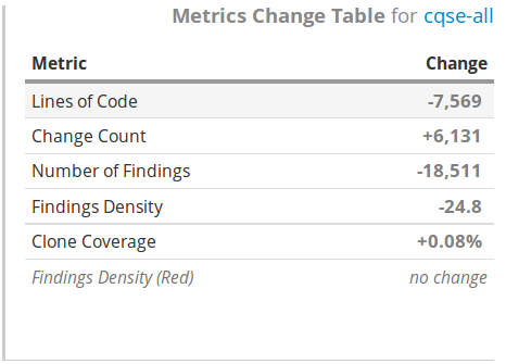
| Purpose | Shows metric changes within a configurable time interval in a table. |
| Metrics | Select the metrics from your analysis profile to be shown in the widget. |
Metric Distribution Pie Chart Widget
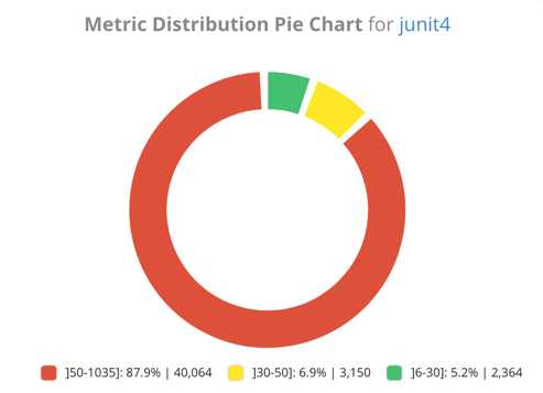
| Purpose | Shows how code distributes over user-defined intervals of a metric. Exemplary questions that can be answered with this widget are: How much of my code is in overly long files? How much of my code is in files with very high clone coverage? How much of my code is in files with sufficient test coverage? |
| Primary Metric | Based on the values of the primary metrics, files are classified into different categories. The categories are described by the boundaries. If you select clone coverage as a primary metric, you can display, for example, how much of your code is in files with very high clone coverage. |
| Boundaries | Sets the thresholds for the primary metric. Based from this thresholds, intervals and corresponding categories are derived. For example, entering two values »0.1 , 0.2« defines three intervals: [0,0.1], ]0.1,0.2], ]0.2, ∞], which could be interpreted as »low«, »medium« and »high« clone coverage. |
| Colors | For each category defined by the boundaries, you can define a color. Colors are assigned in the same order as the interval/categories are derived. |
| Aggregation Metric | After each file is classified based on the boundaries of its primary metric, the aggregation metric is used to calculate the distribution. Choosing lines of code, for example, will give you the percentage of your code (in lines of code) that resides within files with a low/medium/high clone coverage. |
| Legend | Adds a legend. |
| Boundaries in Legend | Adds a legend and the configured boundaries. |
| Show absolute values | Shows also the absolute values of the aggregation metric in addition to the relative distribution. |
Metric Distribution Table Widget
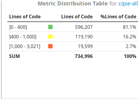
| Purpose | As the previous Metric Distribution Pie Chart widget, this widget shows how code distributes over user-defined intervals of a metric. It only differs by showing the result in a table rather than a pie chart. |
| ... | Please refer to the configuration of the Metric Distribution Pie Chart Widget. |
Metric File Distribution Widget
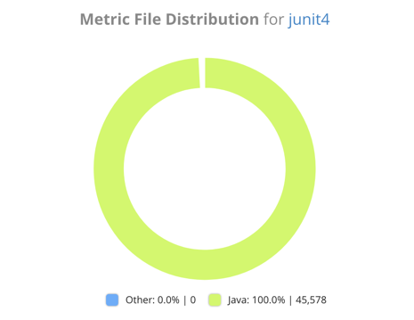
| Purpose | Shows how a size metric distributes over files matching configurable regular expressions. Can be used, for example, to display how the amount of code (in LOC) distributes over Java and JavaScript files. |
| Metric | Choose between LOC, SLOC and Files (Number of Files) to measure the amount of code matching one of your regular expressions. |
| File regexes | Enter the regular expression patterns using Java Regex syntax for which you want to know the code distribution. Examples can be Java:.*\.java$ and JavaScript:.*\.js, assigning the labels »Java« and »JavaScript« to the two categories. |
| Colors | Specify a color for each category of files. Colors are assigned in the same order as the categories are defined. |
| Legend | Include a legend to the widget. |
| Show absolute values | Shows also the absolute values of the selected metric in addition to the relative distribution. |
Metrics Hotspot Table Widget
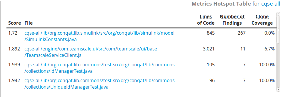
| Purpose | Shows a table with hotspots for the selected metrics. Given the selected metrics, an internal score is calculated to find and rank the hotspots. The smaller the score, the »hotter« the hotspot. |
| Metrics | Select one or multiple numeric metrics. |
| Number of hotspots | Enter how many hotspots (files) should be displayed in the table. |
| Score cutoff | Files with this score or higher will not be shown in the table. |
| Show score | Select whether or not to show the score in the table. |
Metrics Table Widget
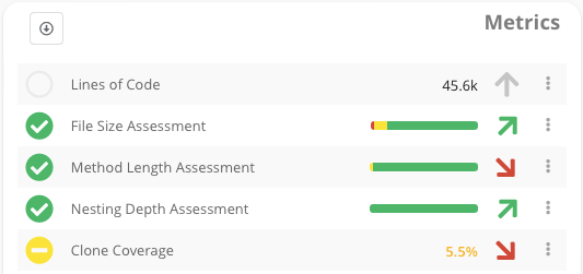
| Purpose | Shows a table with metrics, along with their trend and assessment based on the underlying threshold configuration. |
| Metric Threshold Configuration | Select your threshold configuration. |
| Metrics | Choose the metrics to be shown in the table. Only metrics configured in the threshold configuration are available. |
| Flatten Single Group | Hides the group title if selected threshold configuration contains only one single group. |
| Show values | If checked, shows the values of the metric. |
| Show icons | If checked, shows the assessment icons on the left (red, yellow or green circle) |
| Show trend | Shows the trend icons on the right (red or green vertical arrow) |
| Number of days in future | By clicking on a metric value, assessment or trend you can view the history trend of a metric in a new pop-up dialog. In this dialog, the trend chart can include a certain number of days in the future. This can be used for a burn-down chart, when certain target thresholds are set for a metric in the future. |
Metrics Trend Chart Widget
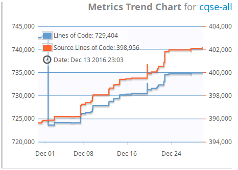
| Purpose | Shows the trend chart for one or multiple metrics over time. |
| Colors | Choose the colors for each metric. Colors are assigned in the order as the metrics are sorted. |
| Show Thresholds | Shows the thresholds. This works only if you selected exactly one single metric and for this metric, there is a corresponding threshold configured in the selected threshold configuration. |
| Metrics | Select one or multiple numeric metrics. |
| Stacked | Stack all metrics on top of each other. Needs »Include 0« and »One scale« to be enabled. |
| Include 0 | Ensures '0' is the start value of the y-Axis. |
| One scale | If checked, all metrics are shown on the same scale with just one axis. Otherwise multiple y-Axis with different scales are used. |
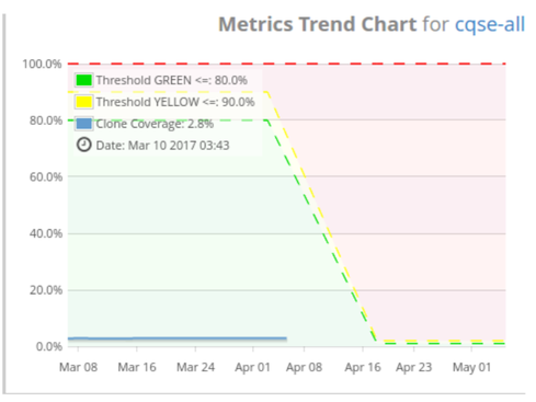
| Number of days in future | Includes future days in the chart with the main purpose to see thresholds configured for the future. Enabling this feature works only, if you selected exactly one single metric and for this metric, there is a corresponding threshold configured in the selected threshold configuration. The second screenshot above shows an example of a trend that also displays days in the future. This can be seen as the blue line indicating the clone coverage stops on April, 5th. The threshold configurations in the example were set up such that they decline over time. |
Numeric Metric Value Widget
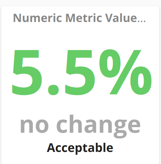
| Purpose | Shows the value of a numeric metric. |
| Boundaries | Boundaries are a light-weight version of a threshold configuration. They allow you to configure thresholds to assess a metric. For example for the metric of clone coverage, you can enter the values »0.05,0.10 «. Using the default colors of green, yellow and red, this configuration would display clone coverage values less than 5% with green color, between 5 and 10% with yellow color and above 10% with red color. |
| Colors | The input for boundaries defines a certain number of intervals. For example, entering two numbers results in three intervals, as explained above. For each interval, you have to pick a color. The color is used as font color of the label when the metric value resides within the corresponding interval. |
| Labels | Analogous to the above, for accessibility, you have the option to assign a label for each interval that corresponds to a selected color. If set, the label is displayed below the delta value. |
Ownership Treemap Widget
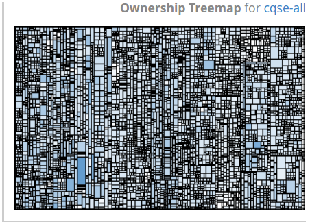
| Purpose | Shows code ownership information for each file in a treemap, i. e. how many developers have changed the corresponding file. The widget reveals, e.g., code areas that only one or few developers are familiar with. To be able to use this widget, you have to enable the "Code Ownership Analysis" in the analysis profile. |
| Exclude merge commits | Exclude merge commits to calculate ownership information. |
| Exclude Teamscale import | Excludes the initial Teamscale import commit to calculate ownership information. |
| Ownership color | Pick the color to display ownership information. The darker the color, the more developers have changed the corresponding file. Areas, that only one developer is familiar with, are displayed in white. |
Single Metric Trend Widget
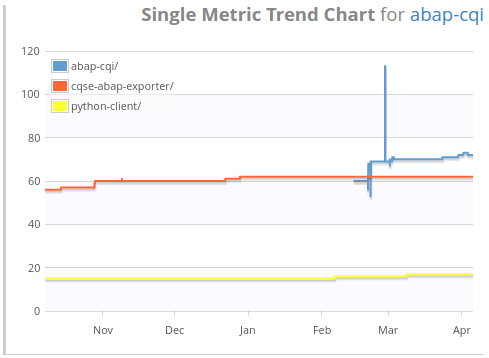
| Purpose | Shows the trend chart for a single metric over time. It can show, however, the same metric for multiple projects. |
| Additional paths | In addition to the normal path which every widget has, you can add additional paths for this widget. For each configured path, the selected metric will be shown as a separate trend line. Hence, you can, for example, show the lines of code for three different projects in one chart and compare their evolution. |
| ... | For the remaining configuration options, please refer to the very similar Metrics Trend Chart Widget |
Test Gap Overview Widget
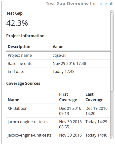
| Purpose | Gives an overview of the results from the test gap analysis. |
| End date | The point in time until changes are considered. |
| Coverage sources | Selects which coverage sources should be considered. |
Test Gap Pie Chart Widget
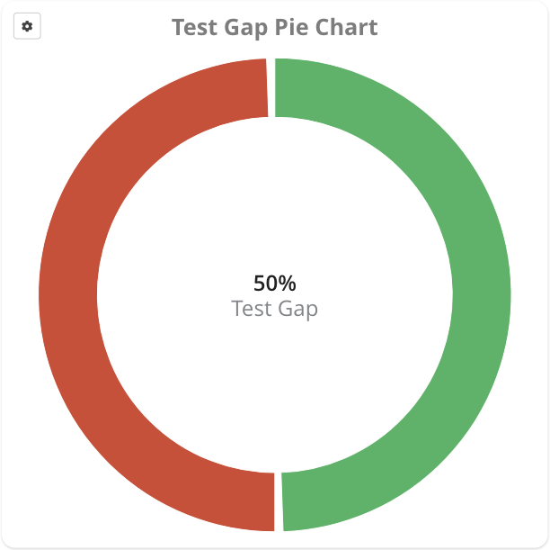
| Purpose | Shows the results from the test gap analysis as a pie chart, with the test gap percentage displayed in the center. |
| ... | Some configuration options have already been described for the Test Gap Overview Widget. |
| Show execution | Shows only the execution information from the test runs (without combining it with change information). |
| Hide unchanged methods | Shows only changed methods, i. e. hides the gray area from the pie chart. This is particularly helpful in case there are only few changes in a large system, which would otherwise make changed methods hard to identify. Cannot be combined with Show execution. |
Test Gap Treemap Widget
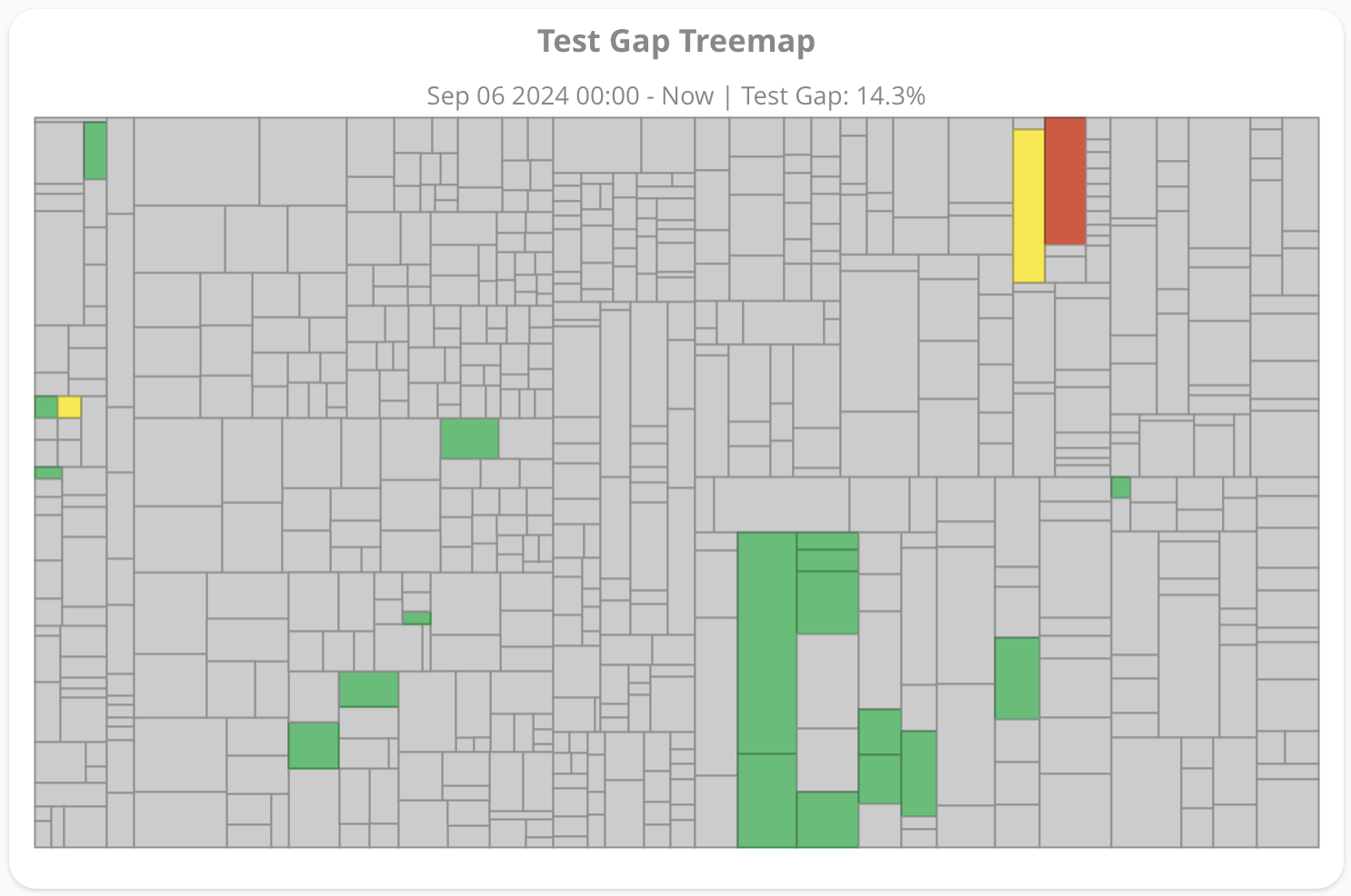
| Purpose | Shows the results from the test gap analysis in a treemap, in which every rectangle represents a single method. |
| ... | Some configuration options have already been described for the Test Gap Overview widget. |
| Show execution | Shows only the execution information from the test runs (without combining it with change information). |
| Outline depth | Determines how many level of packages should be outlined. Outlined packages will be surrounded by a thicker line. |
| Outline color | Color used to outline packages. |
| Hide unchanged methods | Shows only changed methods, i. e. hides all gray areas from the treemap. This is particularly helpful in case there are only few changes in a large system, which would otherwise make small changed methods hard to identify. Cannot be combined with Show execution. |
Test Gap Trend Chart Widget
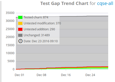
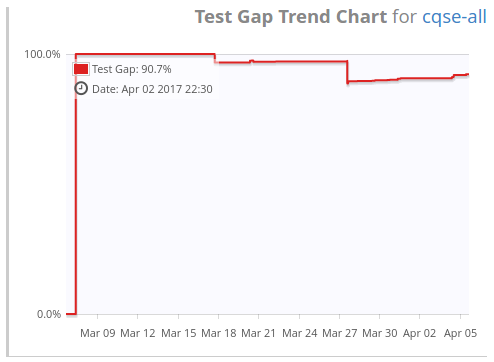
| Purpose | Shows test gap analysis results as a trend chart. |
| ... | Some configuration options have already been described for the Test Gap Overview Widget. |
| Hide unchanged methods | Rescale the y-Axis to eliminate the big gray and uninformative areas to focus on where the trend actually changes. |
| Show percent trend | Shows the test gap analysis information as one single numeric metric (»test gaps«) and displays its trend. This option cannot be used, if the previous one is enabled and vice-versa. |
| Show execution | Show the execution information only (without combining it with change information). |
Treemap Widget
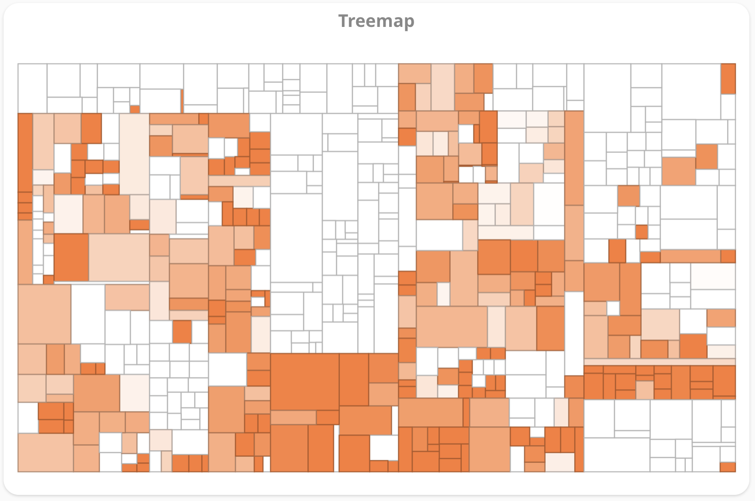
| Purpose | Shows a metric with a treemap in which every rectangle represents a file. |
| Area Metric | Metric used to determine the area size of a rectangle representing a file. Only size metrics are available. If the files metric is chosen, all rectangles will have the same (default) size. |
| Color Metric | Metric used to color a rectangle. In the case of numerical metrics, this means the higher the value for a file, the darker the color for the corresponding rectangle. |
| Color | Color for the treemap. |
| Included files | Only files matching the provided regular pattern are displayed in the code city. To include only Java files, use the Java Regex syntax and enter .*\.java. You can add multiple include patterns, too. |
| Excluded files | Files matching this regular pattern will be excluded from the treemap. |
| Minimum value | Only for numeric metrics. All values equal or below this value are colored with white. Use -1 to automatically use the lowest metric value as minimum value. |
| Maximum value | Only for numeric metrics. All values greater or equal to this value are colored with the specified color. Use -1 to automatically use the largest metric value as maximum value. You might want to use this option if you have a single but very large value - an outlier - in your data set which almost dismisses the gradient in the coloring in the treemap. |
Issue-based Metric Treemap Widget
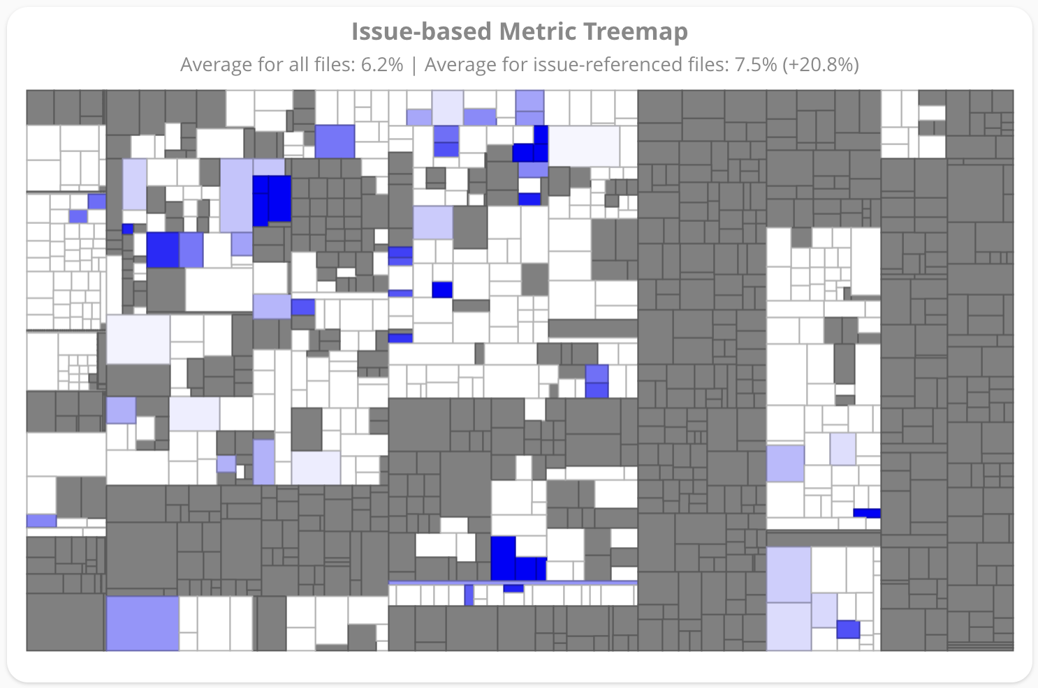
| Purpose | Helps to identify whether a quality metric (e.g. finding density or line coverage) correlates with defect hotspots in the code. |
| ... | Some configuration options have already been described for the Treemap Widget. |
| Stored Issue Query | Show those files in color which are referenced by the issues that match the given stored issue query. |
| Exclude non-referenced files | Exclude those files from the treemap that were not referenced by any issues. |
| Show weighted averages | This option is available if a numeric metric is selected as color metric. Shows a summary on average metric value over all files and only issue-referenced files. The average value calculation is weighted by the selected Area Metric. For example when selecting LOC as Area Metric, longer files have a larger impact on the result. |
| Show assessment ratios | This option is available if an assessment metric is selected as color metric. Shows a summary on the percentage of files that are green, yellow or red over all files and over all issue-referenced files. |
Metrics Scatter Plot Widget
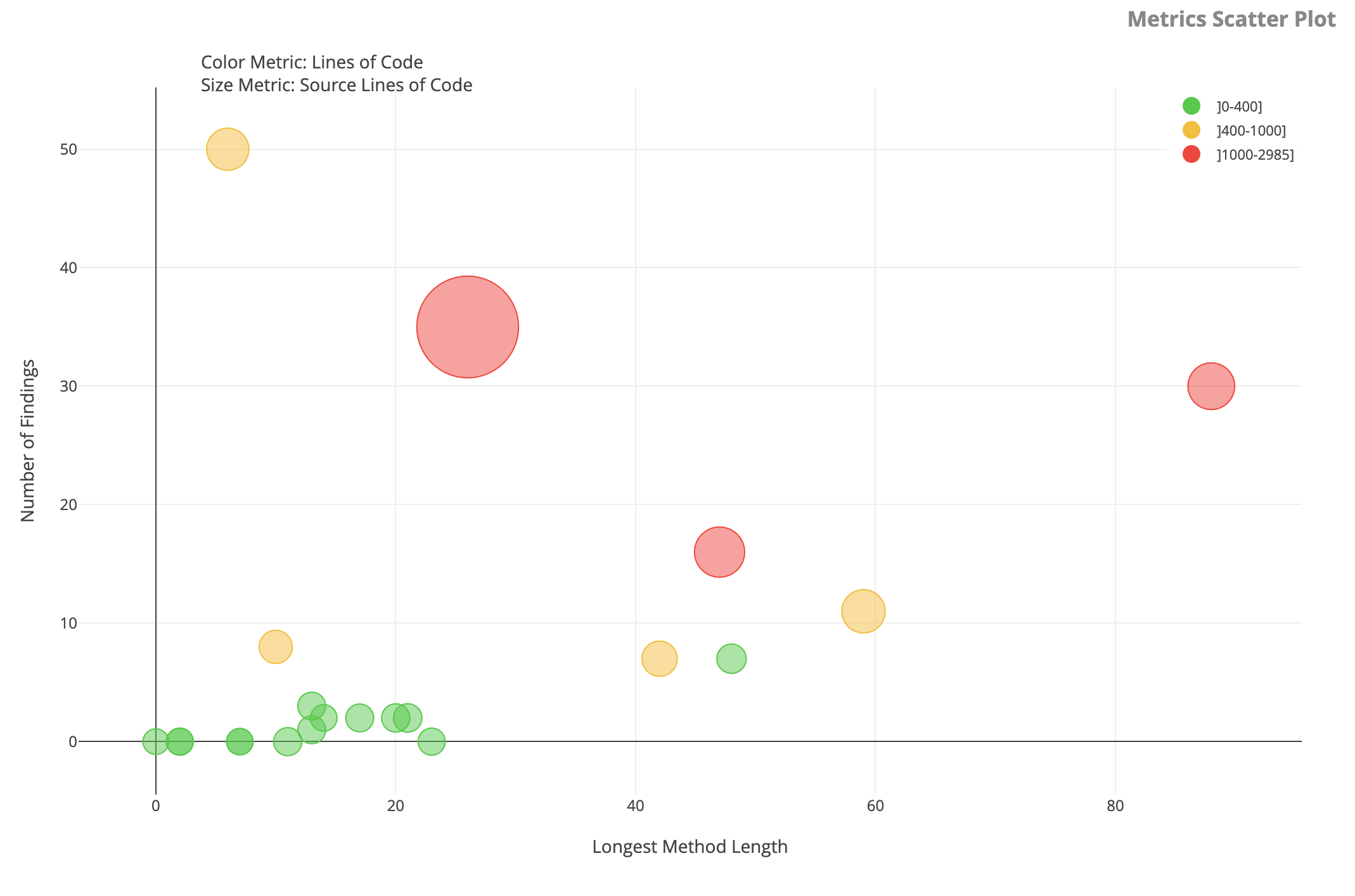
| Purpose | Visualizes up to four different metrics for each file in the source code. Each file is represented by a marker. Two metrics define the x and y position of the markers. Another two metrics can be used to represent the color and size of the markers. |
| Vertical Metric | Metric used to determine the vertical position of each marker. |
| Horizontal Metric | Metric used to determine the horizontal position of each marker. |
| Use Color Metric | Enables the 'Color Metric'. In that case the options 'Color Metric', Boundaries and 'Colors' are used to determine the colors of the markers; otherwise the 'Default Marker Color' option is used. |
| Color Metric | Metric used to determine the color of each marker, if the 'Use Color Metric' option is enabled. |
| Boundaries | Sets the thresholds for the 'Color Metric'. The intervals are derived with these boundaries. The thresholds are entered as comma separated list, e.g., "10,20,30". These thresholds result in the intervals (-∞; 10], (10; 20], (20; 30] and (30; ∞). To match these intervals, the Colors option has to provide four colors. |
| Colors | For each interval defined by the 'Boundaries' option a color is selected. The colors are assigned to the intervals in the same order. |
| Color Metric Legend | If the box is checked, the legend of the color metric is displayed. In the legend all colors are mapped to their corresponding intervals. The intervals are specified by the 'Boundaries' option. |
| Default Marker Color | If the 'Use Color Metric' option is disabled, all markers will have this color. |
| Use Size Metric | Enables the 'Size Metric'. In that case the sizes of the markers are calculated by the options 'Size Metric' and 'Size Metric Range'; otherwise the 'Default Marker Size' option is used. |
| Size Metric | Metric used to determine the color of each marker, if the 'Use Size Metric' option is enabled. |
| Size Metric Range | Defines the range of sizes the metric value gets mapped to. The bigger the 'Size Metric' value is, the bigger is the size of the corresponding marker. The range is entered as a comma separated pair of a lower and an upper bound. |
| Default Marker Size | If the 'Use Size Metric' option is disabled, all markers will have this size. |
| Marker Opacity | Opacity of the markers. Should be a value between 0 and 1. |
Task Summary Pie Chart Widget
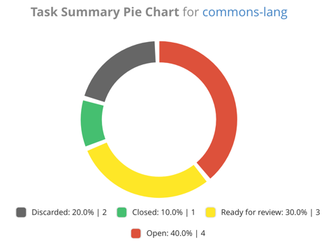
| Purpose | Shows a summary over the states of the tasks created in the Quality Control > Tasks view. |
| Additional paths | In addition to the normal path which every widget has, you can add additional paths for this widget. For each configured path, the selected metric will be shown as a separate trend line. Hence, you can, for example, show the lines of code for three different projects in one chart and compare their evolution. |
| Legend | Include a legend. |
| Show absolute values | Shows the absolute number of tasks in the legend in addition to the percentage values. |
| Show discarded tasks | Includes discarded tasks as separate category in the summary. |